Amazon Navigation
In 2014 I was the lead ux designer for a project to update the main navigation on Amazon.com.
We went through quite a process, much of which is still confidential. But here is where we ended up.
The Problem
Amazon's site header had not been updated for over two years and was starting to look dated. Content had been added gradually over the previous two years and the overall design was starting to feel cramped.
The Challenges
Adjusting anything in the main nav at Amazon, even by a pixel or two, makes and loses millions of dollars for the impacted businesses. So a project to redesign the navigation becomes intensely political - quickly.
How I Helped
I created over 20 fully different navigation concepts, ranging from complete overhaul to small changes. We did in-house usability tests, and ran A/B tests on the live site for several variations.
The Result
We launched the first update to Amazon.com's desktop site header in over two years. It improved performance, prioritized elements that were most valuable to users (like search), and helped the user more quickly understand Amazon's pages by differentiating the navigation from the rest of the page content.
A focus on search
We moved the search box up beside the Amazon logo to give it more priority. The overall color was updated to a blue/black tone that also helped elevate the search field and separate the nav from the rest of the page content
amazon's Devices
In addition to elevating search, we increased visibility for Amazon's Devices, since at this time the Fire Phone was about to launch, shortly followed by the Fire TV. Kindles and Fire Tablets were already a key part of the Amazon device family.
a clearer, more usable navigation
One of the goals for this update was to make it easier for the user to quickly focus on the important part of the navigation for their task. Some of the methods we used to accomplish this were: removing visual clutter, adding better active and focus states, and improving visual hierarchy for the key content in the nav. We also removed superfluous or misleading text. "Shop by Department" became "Departments", the word "Cart" next to to the shopping cart icon was removed, "Jason's Amazon" became "Recommended for You", etc.
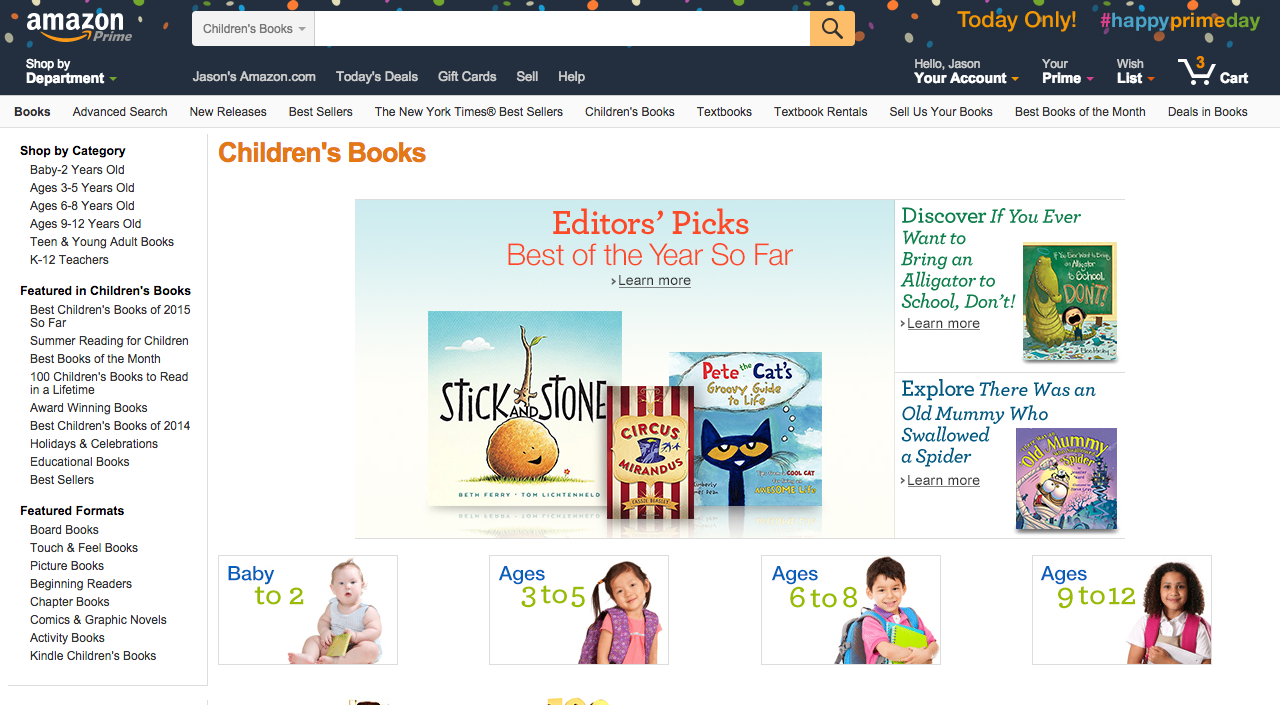
WHAT HAS LAUNCHED SO FAR
The nav that is currently live on the site uses the darker color background and has moved search up beside the amazon logo. It looks like this.