A&F Audience
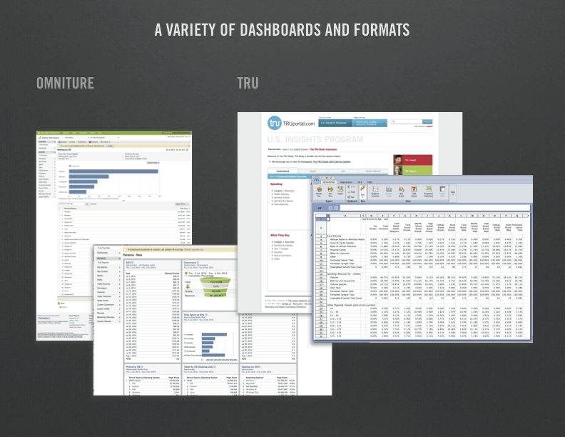
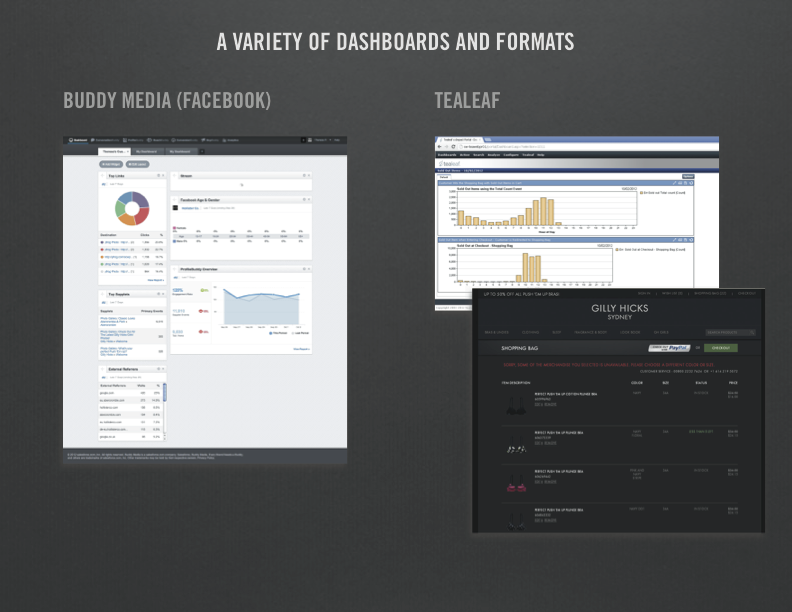
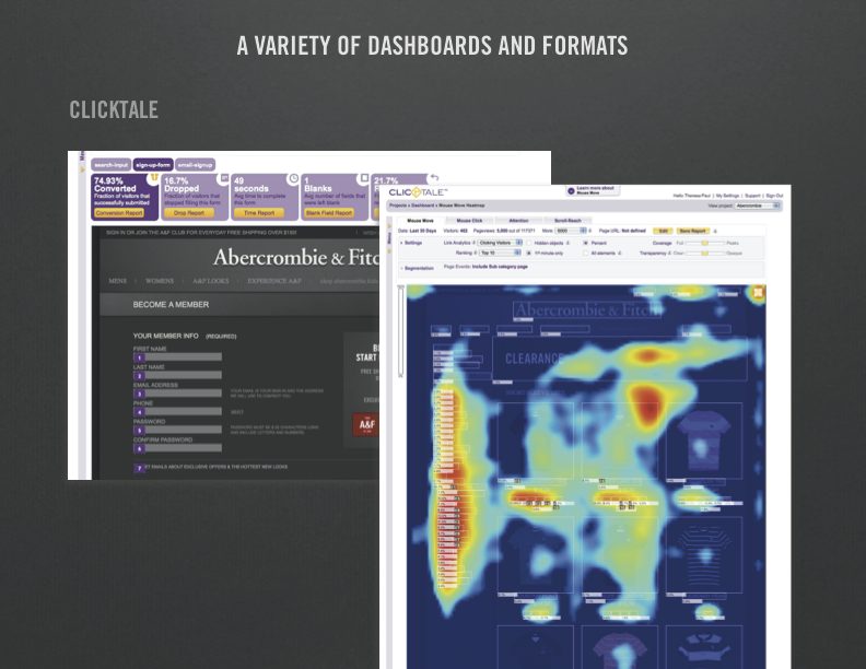
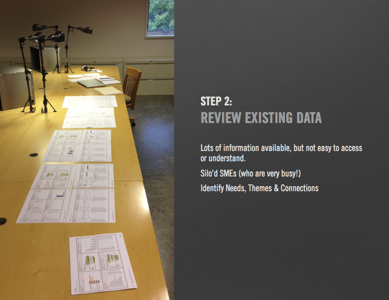
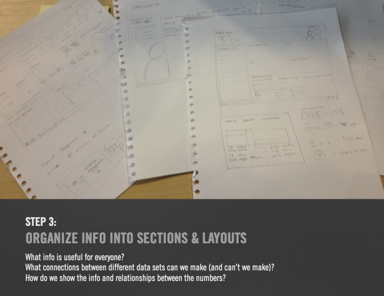
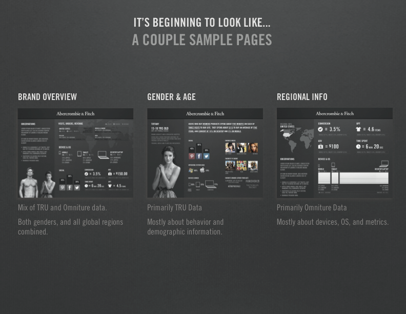
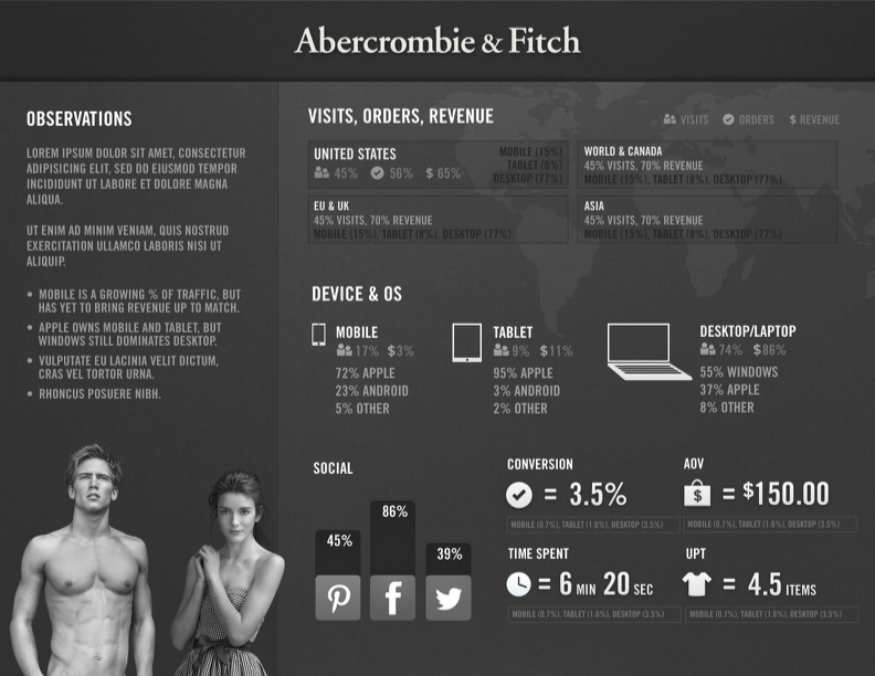
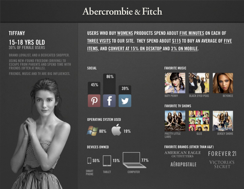
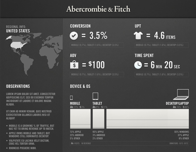
Even though it is critical to use data to inform business and ux decisions, I observed that often the available data wasn't used. It was buried in various siloed tools. And each tool often required a full training course to use! People are busy, and getting insights from the data is time consuming. So I wondered if we could use our visual design and usability resources to create a more interesting and easily consumed summary presentation of the data to be used internally at A&F. I pitched a concept for a templated data-based overview of our key user demographics.
The ultimate goal for this project was to build an internal portal for these dashboards, from which audience segments could be sorted by region or other criteria.
Here are several slides from the initial project pitch.
Results
Ultimately this tool was not implemented. This was primarily because I left A&F for Amazon shortly after creating this pitch. However, it's likely also because I believed the merits of it were obvious, and didn't anticipate that leadership would be skeptical. So I was not prepared to battle uphill for it. I think it is likely that if I had stayed at A&F and created this document for a couple quarters in a row, it would have been adopted and used to guide business decisions.
Lessons Learned
The merit of a concept is not likely to be immediately clear to others.
Don't assume others have the same perspective, especially about things you think are obvious.
It's always necessary to convince.
Clearly communicating and winning people over to your idea is almost as important as the idea itself.
