Amazon Mobile Navigation
The Problem we were solving
The taxonomy and navigation presented on kindle, android, iOS and windows apps were all slightly different. Additionally, none of them matched the navigation options presented on the website. Lastly, the mobile version of the website had different navigation from the desktop version of the website. This created a confusion and frustration for users.
The Challenge
The variation in taxonomy was a result of separate individual teams owning each product, so solving it meant winning multiple team's trust. It also meant creating a solution they all could agree was worth implementing. Additionally, the desktop shop by department taxonomy was department driven, and the app and mobile taxonomies were all auto-generated based on search's taxonomy. Search is a separate org in the business, and was not fond of the idea of giving up ownership of browse navigation.
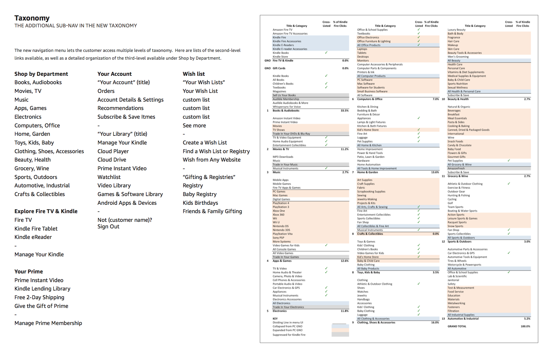
The solution
In 2014 there was a project to update the navigation on kindle's shopping app. Because this app was built on Android's OS, we could get pairity on our Android shopping app immediately.
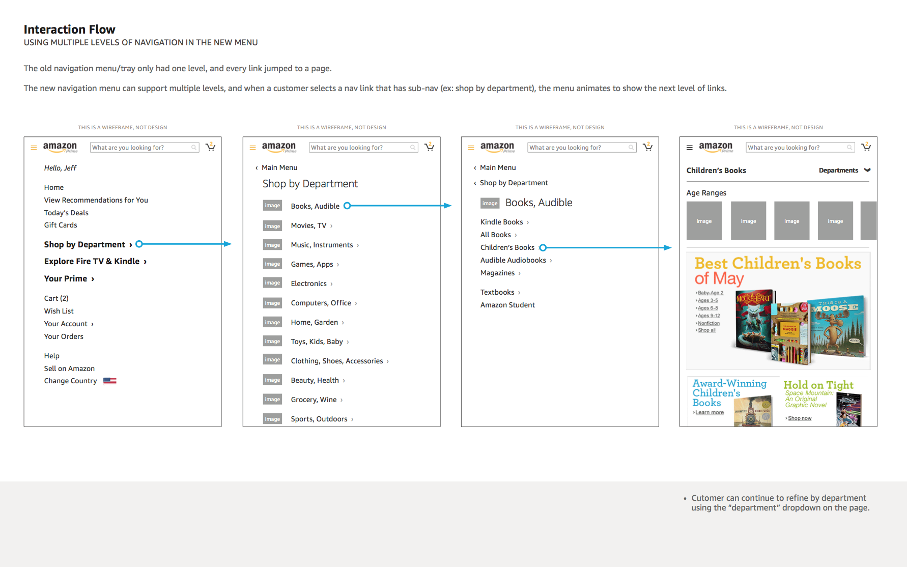
We took this opportunity to dig a bit deeper in the taxonomy and recommend a meet-in-the-middle shop by department taxonomy that bridged the gap between the search driven taxonomy and the department driven desktop SBD. It layered the existing SBD categories on top of the existing Search Taxonomy in a way that minimized changes and maximized pattern consistency.
Once we had a proven and internally approved consistent framework, we recommended this as the navigation pattern for all of Amazon's browse navigation experiences, on every app and all web properties.
Starting with Kindle & Android Tablets
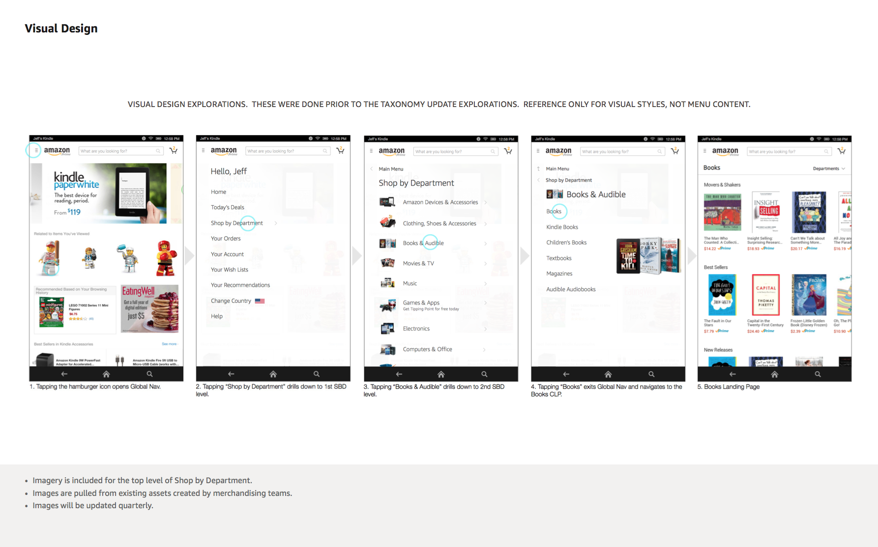
This update successfully launched on Kindle and Android tablet shopping apps in 2014.
Other platforms
While working on the kindle and android update, we also created matching documentation for the iOS tablet shopping experience, and explored using this new nav on the website when viewed on a smaller screen.
Phones
While working on the tablet designs, we were simultaneously designing for phones. Amazon recently began (summer 2015) testing the new navigation on the phone website experience.


Here is a video of the flow.
Phone App Nav
Lastly, we also explored moving the app navigation to the bottom of the screen for iOS (and in the future android) phone apps. This was to support better navigation (reach) on larger screen devices.